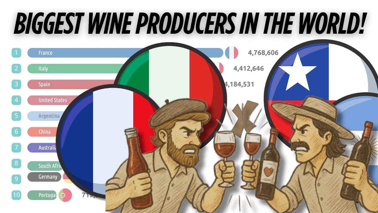
Discover the evolution of global wine production in this dynamic bar chart race! 🍷📊
Watch as the world’s leading wine-producing countries rise and fall in the rankings over six decades, based on total wine production in liters. This data visualization showcases how countries like France, Italy, Spain, and the United States have shaped the wine industry through time.
Whether you’re a wine enthusiast, data lover, or just curious about global trends, this video offers a fascinating glimpse into the changing landscape of wine production around the world.
🌍 Data source: FAO (Food and Agriculture Organization of the United Nations)
📊 Format: Animated bar chart race
Don’t forget to like, subscribe, and hit the bell 🔔 for more data-driven content like this!
#WineProduction #DataVisualization #WineStats

