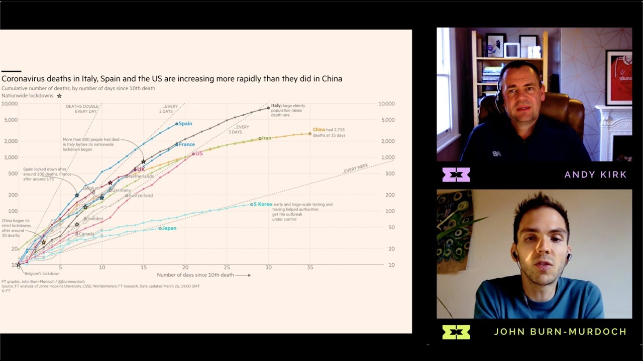
Welcome to Episode 3 of Season 1 of Explore Explain, a video and podcast series all about data visualisation design. In this third episode I am delighted to welcome John Burn-Murdoch to share the design story behind his visualisations for the ‘Coronavirus Tracker’, which has been evolving on the Financial Times’ website since February 2020. This episode was recorded on 27th March.
As well as watching this show, you can listen to the conversation on your favourite podcast platforms. Visit visualisingdata.com/podcast to find out more about this series and to read about each episode.

